Case Study
Designing a Document Browser

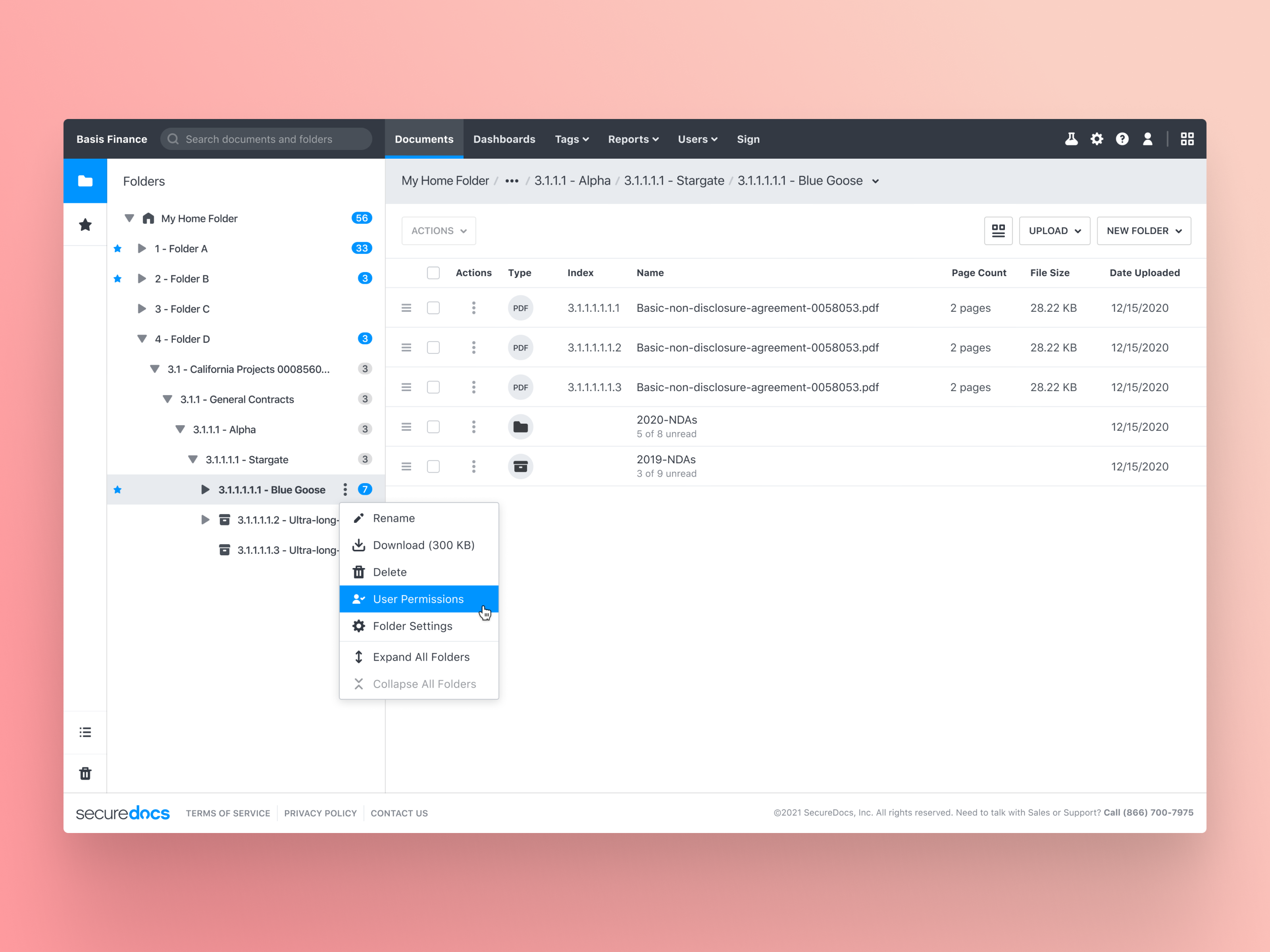
A look at SecureDocs' file browser app.
In 2018, I became SecureDocs' first UI Designer and worked closely with the engineering team. My primary objective was to establish a simple but effective design process for our expanding cross-functional team. It included developing prototypes for product development and constructing a comprehensive component library to support engineers in implementing new features.
One of my early projects where I utilized this process was redesigning SecureDocs's file browser interface, an essential tool for our customers. It was a collaborative effort and a notable achievement for our small, cross-functional team.
The main purpose of the file browser app is to serve as a centralized hub for customers to manage business documents, including contracts. We aimed to create a user-friendly interface similar to Microsoft's "File Explore" or Apple's "Finder," allowing users to effortlessly interact with their documents with patterns such as drag-and-drop or contextual menus where they'd expect them.
Problems
The two primary problems (or opportunities) that needed to be addressed were:
- Providing a refreshed look and feel for the file browser. The old design, while still heavily used, had become stale, had accessibility issues, and required a designer's touch, as it was primarily assembled by the engineering team with a focus on speed and practicality.
- Ensuring the design was flexible enough to handle multiple brands. The core application's specific features are grouped and branded for different markets. The SecureDocs brand targets businesses seeking a temporary solution for sharing business documents during mergers or acquisitions, while the ContractWorks brand is aimed at finance teams looking to organize and tag their contracts.
Solutions
Visual design is one of my core skills (who doesn’t love pushing pixels?), and I relish the opportunity to create designs that are fresh and revitalizing. When this project came my way, I dove in deep.
Developing Details
While working on a new redesign, I concentrated on creating an "effortless" user experience, a significant challenge in product design. For the file browser, we prioritized several key elements to ensure it felt seamless for the customer. The file browser's sidebar, in particular, required meticulous attention.
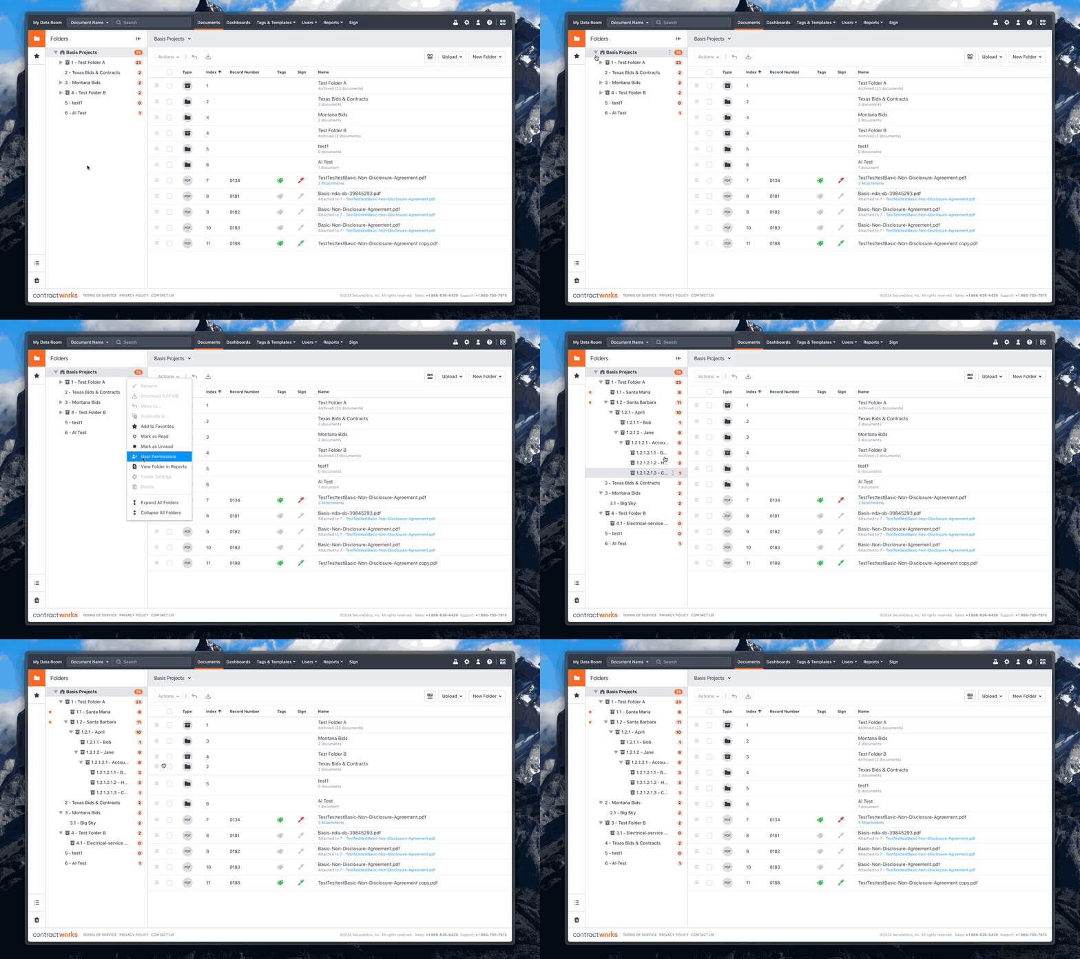
The sidebar's primary function was to enable users to navigate their folder structure, with the main section displaying the contents of the selected folder. In the sidebar, users can expand elements, nest folders, drag documents, and perform additional actions. The challenge was to deliver a clean, intuitive design that encompassed all these functionalities.

A look at SecureDocs' file browser app.
Themeing
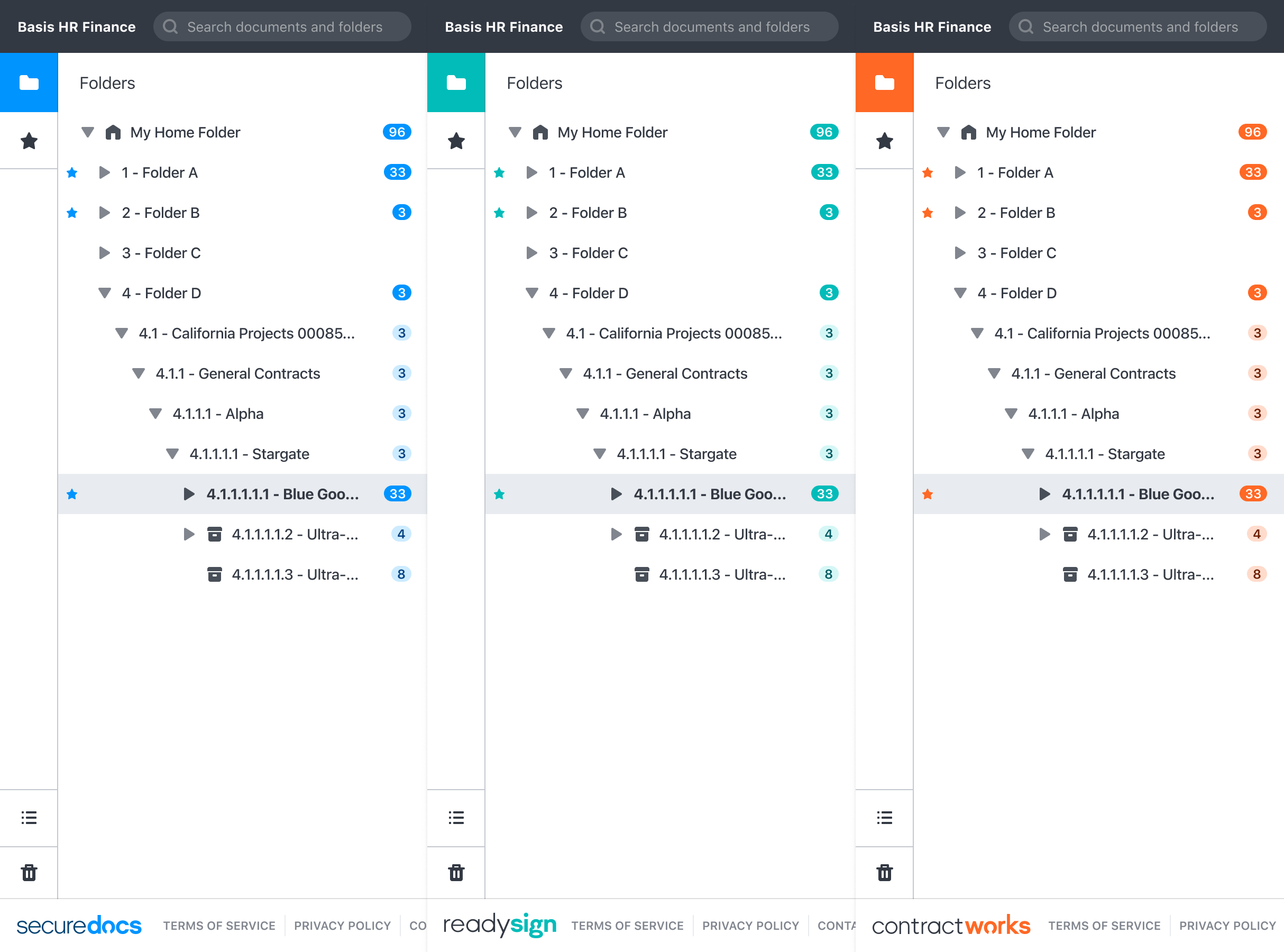
To ensure the design remained adaptable for accommodating multiple brands and aiding marketing efforts by promoting three products without sacrificing user experience, I devised a color-theming system for specific UI elements. This system allowed each product to have its distinct appearance while ensuring ease of maintenance.

Themeing displayed across the 'Sidebar' component.
Impact
The project yielded remarkable results, with annual document uploads skyrocketing from nearly 1.7 million in 2019 to over 4.9 million in 2023, marking an impressive growth of nearly 194%. Moreover, the visual design language developed during this endeavor laid the foundation for our design system, "Basis," proving invaluable to myself, my colleagues, and future team members throughout my time on the SecureDocs product team.
Overall, this project provided numerous valuable lessons. We honed an efficient design process, fostering close collaboration with the engineering team to craft a seamless user experience. Key features, such as the sidebar for intuitive navigation and drag-and-drop interactions, were meticulously prioritized. The implementation of a color-theming system underscored the delicate balance between branding and user experience. The most rewarding aspect was witnessing the positive customer response to the design, despite changes to familiar functionality. The feedback was overwhelmingly positive, and usage surged.